
Knowledge Transalation
Jan 2025 - April 2025
Team Project
AI Website
Project Overview
My Role
This project aims to develop a web-based application that leverages AI features to generate structured research summaries. After consultation with the Digital Experience Lab (DXL), we determine content should be offered in multiple formats, including text summaries, infographics, audio podcasts, and a voice chat feature, to suit different learning preferences. By offering multimodal research content, we aim to support lifelong learners with diverse educational backgrounds and help them engage meaningfully with scholarly discourse.
-
Project Manager
-
UI Sub-team leader
About
Duration & Budget
10 weeks, Academic course project (no formal budget, open-source development)
Technology & Tools
Figma, Design Systems, UI Prototyping, User Testing, AI Feature Integration, Cross-functional Collaboration (with UX researchers & developers), Notion
My Key Contributions & Impact
-
Led the UI design sub-team while applying the Scrum framework in Notion to manage sprints, update task boards, and track progress across design and development.
-
Coordinated weekly team meetings and design reviews, ensuring alignment between UI, UX, and development teams.
-
Communicated regularly with stakeholders to gather requirements, share progress, and incorporate feedback into design iterations.
-
Designed homepage, browse screen, article profile, and landing page layouts in Figma, transitioning from low- to high-fidelity prototypes.
-
Integrated survey and usability test results into design refinements, improving navigation flow and content discoverability through features like trending sections, sidebar navigation, and filtering/sorting tools.
-
Established a shared design system to maintain visual consistency across pages and streamline the developer handoff process.

Project Goal
-
Web-based application using AI to provide concise, engaging, and accurate research summaries
-
Improve accessibility without compromising research integrity
Challenges
-
Time constraints
-
Specialized content
-
Jargons
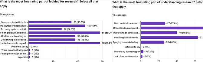
User Research
Our user research focused on identifying key barriers to academic research accessibility. We conducted surveys (n=98) targeting young adults and students, uncovering pain points like paywalls, technical jargon, and confusing site layouts. Personas and user journeys were developed to guide design priorities, and usability tests were performed to refine navigation and layout. Findings showed strong user preference for text summaries and infographics, which directly informed our feature development and UI design decisions
Design
Early Stages
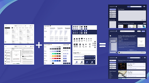
We began with low-fidelity wireframes focusing on the homepage and article profile page, laying a flexible foundation for scalable design. A consistent design system—including color palette, typography, and UI components—was established to ensure visual coherence. This system allowed us to quickly scale the layout to additional pages like the browse and landing pages. Early collaboration between UI and UX teams ensured the designs were grounded in user needs and adaptable to future development


Mid-Stages
In the mid-stage of development, we iterated from low-fidelity to high-fidelity prototypes, refining layouts, visual hierarchy, and interactivity. These updates were informed by user research insights and guided by our established design system. We focused on ensuring content clarity and responsiveness, particularly as new features like AI-generated summaries and filtering tools were introduced. Cross-functional feedback loops with UX and development teams helped validate design decisions and streamline implementation

Article Profile Page
The article profile page became a key focus as we prioritized multimodal content delivery. Initially designed with a two-column layout, the page was redesigned into a single-column format to reduce visual overload and highlight core features: text summary, podcast, infographic, and recommendations. Each section was ordered based on user information needs, with the original paper accessible but no longer the central focus. The design aimed to support quick scanning, accessibility, and progressive content engagement


Mascot
To make the research platform more approachable, we introduced a mascot named R.A.T. (Research Accessibility Team), designed to humanize the user experience and guide interaction with the voice chat feature. Drawing inspiration from lab animals and the computer mouse, the mascot evolved through multiple visual iterations to balance playfulness with professionalism. It appears on the landing page and within the voice chat system, offering users a friendly, supportive presence throughout the site while reinforcing our brand identity


Usability Test
To evaluate the effectiveness of our prototype, we conducted task-based usability tests where participants navigated the site while thinking aloud. These sessions revealed friction points in menu structure, button clarity, and content hierarchy. Post-test interviews provided additional user insights, helping us refine the interface for accessibility and simplicity. Based on this feedback, we streamlined user flow, adjusted unclear elements, and improved overall engagement with key features like infographics and navigation paths

Backend
AI Voice Chat Test

Process
Our backend was built using Python and FastAPI, with a strong focus on integrating OpenAI’s Realtime API to power our interactive voice chat feature. We adopted a modular, scalable backend architecture that allowed seamless connection with the frontend and AI tools. Using Retrieval-Augmented Generation (RAG), we embedded academic papers into a vector database, enabling context-aware responses to user queries. A key backend goal was low-latency, voice-to-voice interaction, which we achieved by switching from WebSockets to WebRTC for real-time audio communication. This approach ensured a dynamic, human-like dialogue experience while supporting future scalability


